Shopify Plan Settings
Shopify's Settings page didn't make it easy for users to find and downgrade their Shopify plan. I improved the information architecture, content grouping, feedback loops, and UI content to make it more intuitive.
The problems
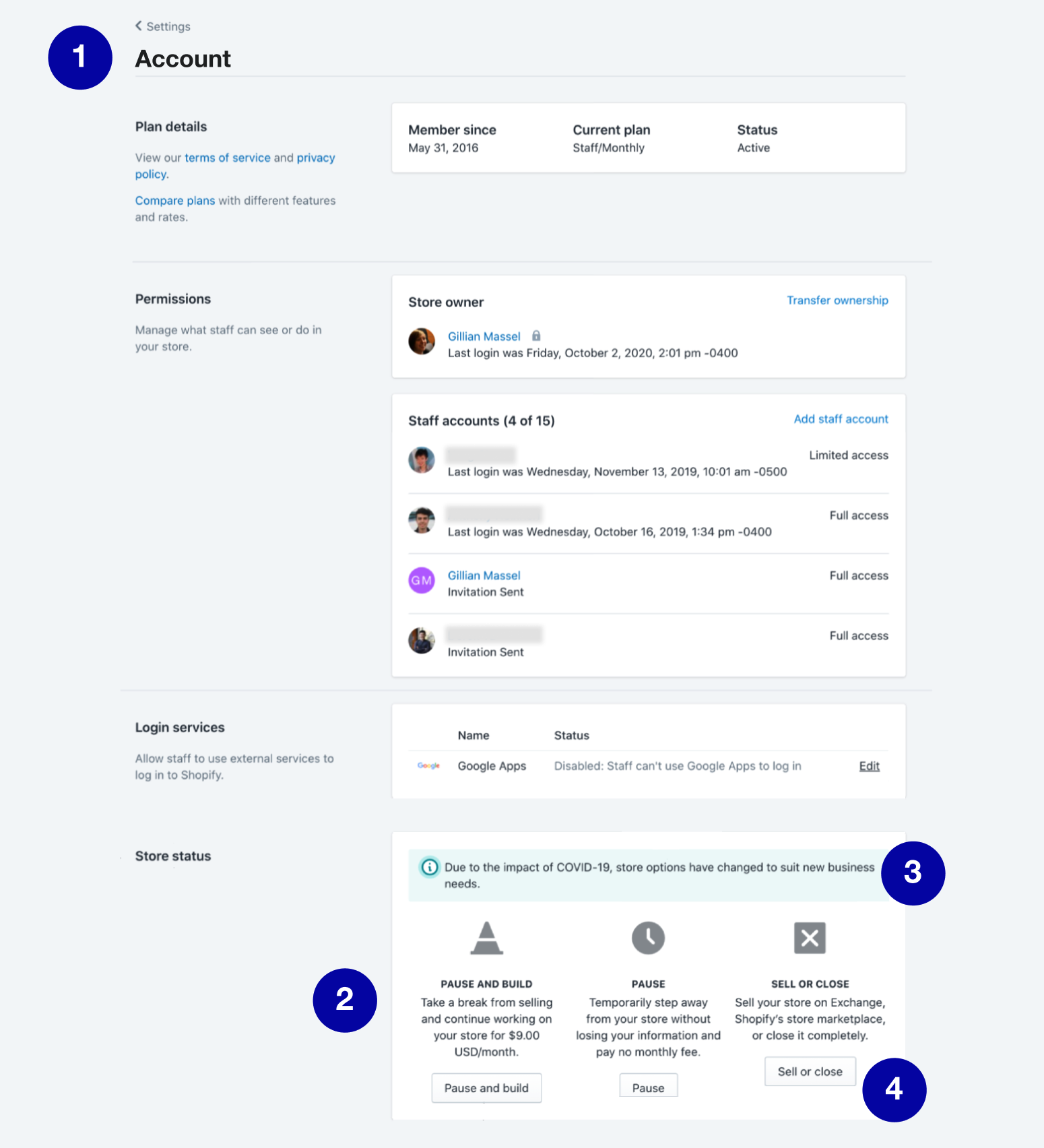
1. Information architecture: Plan settings were lumped in with staff management settings under a menu option called "Account." This label didn't give a strong enough information scent for users who were looking to make changes to their plan.
Furthermore, the page layout didn't communicate the right relationships between content. Staff management settings were wedged in between plan information and the ability to change your plan.
2. Visual design: Center-aligned text was inconsistent with the rest of the page and created weird "rivers of white." Major icons were being used in place of spot icons.
3. UI content: The content in the downgrade section was vague, didn't communicate a clear distinction between downgrade options, or didn't follow our styleguide standards.
4. Missing feedback: After a user cancelled their plan, there was no record or confirmation of their action.
The constraints
Business goals needed to carefully balanced with user needs: Shopify makes revenue from plan subscription fees, so any changes we made needed to prevent hasty or impulsive plan cancellations. But we also couldn't make it too difficult for a user to cancel their plan, because that would be frustrating and potentially create a dark pattern, like a roach motel.
There was no full-time team dedicated to improving or maintaining this area: Plan settings weren't a high traffic page or a flagship feature, so making improvements wasn't on any team's roadmap. That meant we were going to have to be creative with how we resourced this project.
How I solved this
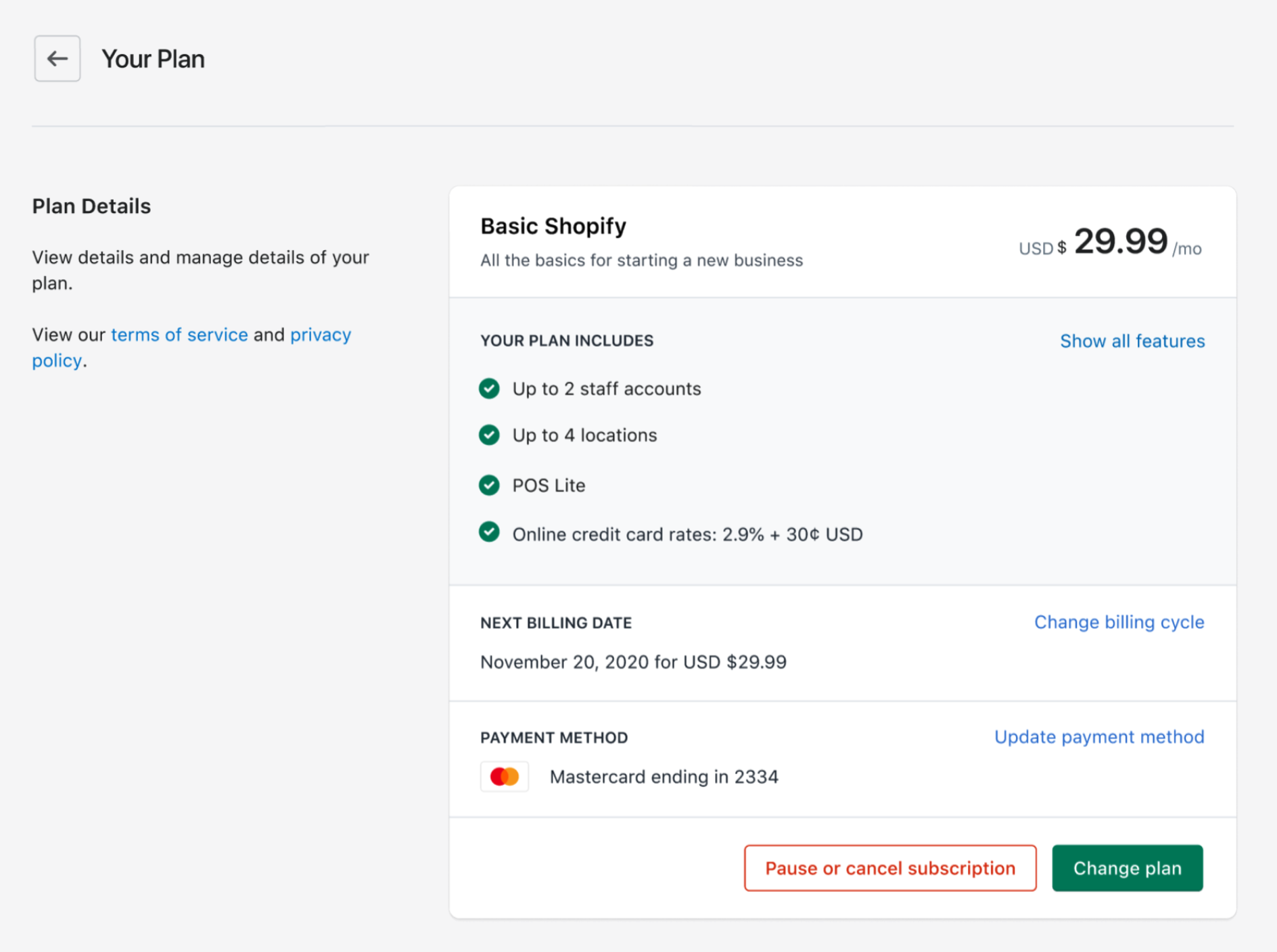
I reorganized any information about a user's plan so it was all together in the same area. This meant that it would be easier for a user to review their current plan information, so they could make a more informed decision about whether to downgrade or not.
Then, working with my designer, we decided that the best way to execute this concept was to create a new Settings page called "Plan".
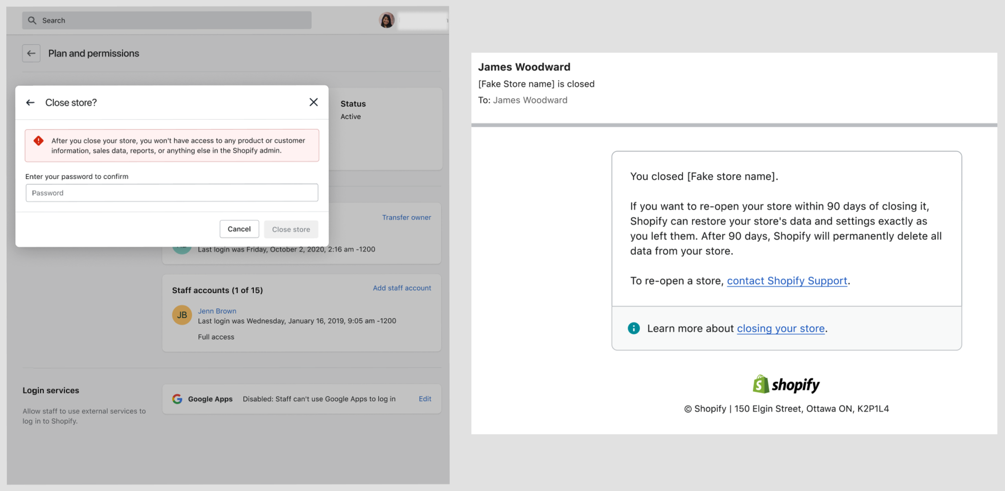
I implemented proper feedback mechanisms like warning banners and confirmation emails. If a user decided to close their store, it seemed important to explain the consequences of this action, in case they wanted to export and save important business data before closing. I added a warning banner to alert them to the consequences. Then, after a user closes their store, I created a confirmation email so they would have a proof of record of this change. The email was also a useful touchpoint to explain our data deletion policy.
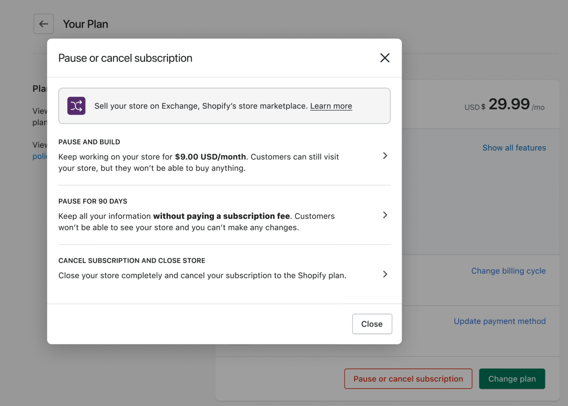
Working with my designer, we re-designed the visual layout and re-wrote UI content to allow users to more easily compare downgrade options. Selling your business and closing your Shopify store are two very different tasks. It didn't make sense to have them lumped together as one downgrade option. In our new approach, we separated these tasks. In addition, we made sure to emphasize or clarify the key differences between the two types of Pause options: a) the cost, and b) whether customers can visit your store or not.
The results
To properly measure the effect of these design changes on plan cancellations, we ran an A/B test for 1 month. The results were:
- No measurable impact on the rate of cancellations
- No measurable impact on plan upgrades
- No measurable impact on support tickets
- A slight increase in plan downgrades
At first glance, an increase in plan downgrades might indicate that the new design performed more poorly than the old one. However, when you consider the broader social context, it's difficult to attribute the increase in plan downgrades solely to the design changes. The new design was launched April 2021 — which was in the middle of global pandemic — so it's likely that other factors contributed to the increase in plan downgrades. More research is needed. And since there was no measurable impact on plan cancellations, then the data suggests that the design is effective at introducing users to alternative downgrade options other than cancelling their plan entirely.
Conclusion
While there's still many little details I want to agonize over, I'm very proud of the improvements we made — especially in terms of information architecture, content organization, and overall visual design. In the new design, information is organized much more intuitively, and users have access to the right information to make the right decision when downgrading.
Post a comment