Two-step authentication
When a user reset their password, we wanted to encourage them to add two-step authentication to help protect their account. I identified and articulated the problem, created a new content hierarchy, wire-framed solutions, and wrote the final UI content.
The problem
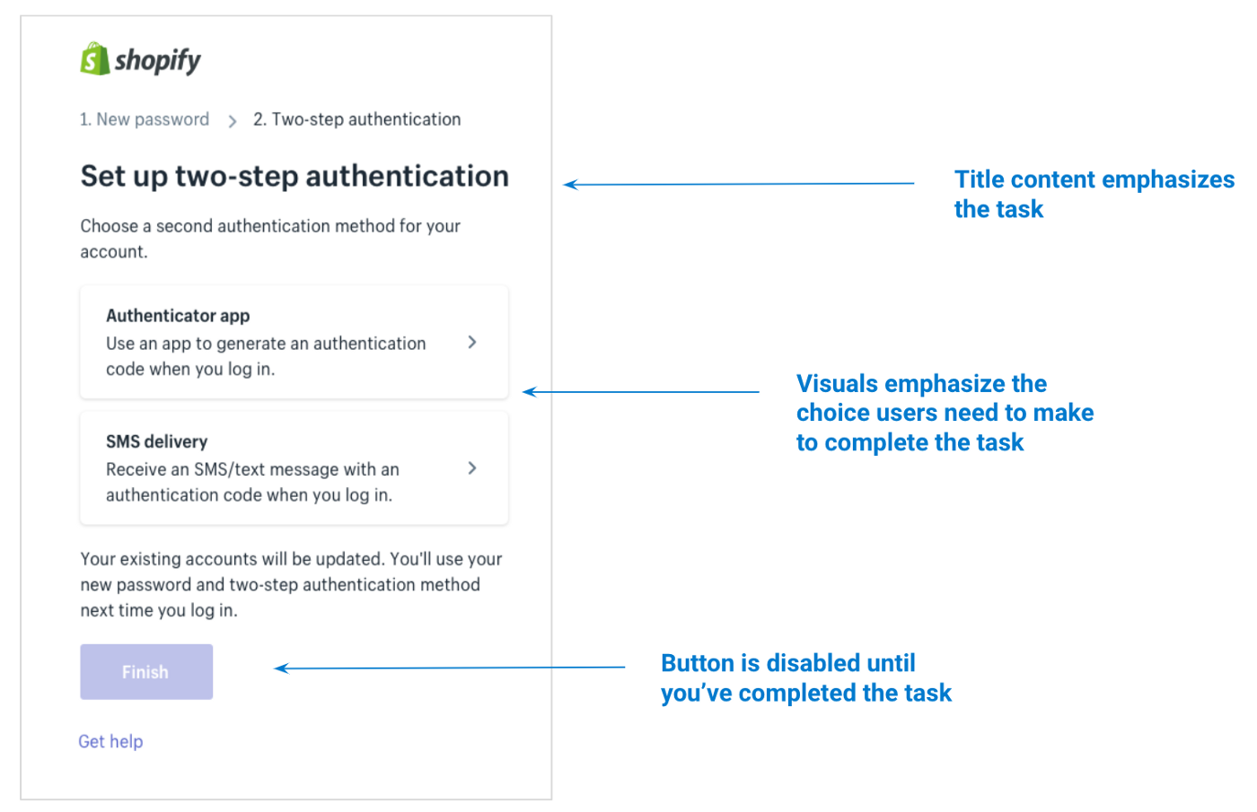
The current design of the 2-step authentication page was very focused on the task we wanted users to complete. This meant it was making two very risky assumptions. First, the design assumed that users already understood what two-step authentication was. Second, the design also assumed that all users would definitely want to add two-step authentication to their account. Why wouldn’t you want to make your account more secure?!
My first iteration
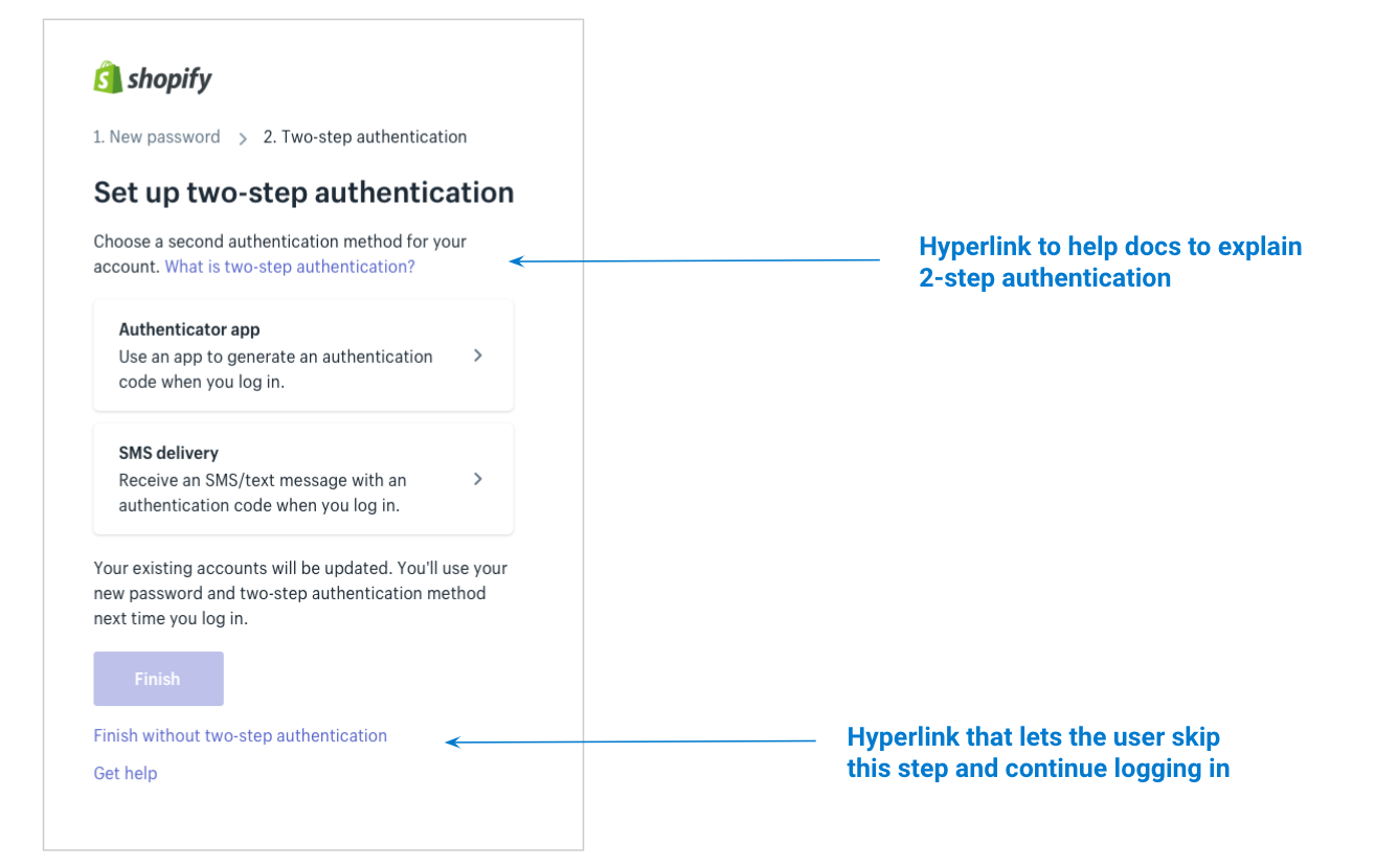
To try and solve these problems, I thought that it would be a good idea to teach users about two-step authentication, and also give them a way to skip this step if they didn’t want to set up two-step authentication right away.
But instead of taking a step back and reconsidering how this new information would best integrate into the existing design, I just stuffed some extra links into the design and sent it away for usability testing.
Unsurprisingly, these were the results of the usability testing:
Users didn’t understand what 2-step authentication was
Users didn’t realize they could skip this step
The REAL problem
Thoroughly humbled by our user feedback, I took a step back and took a hard look at the current design to try and figure out the root cause of the problem.
I realized that users actually had two decisions to make even though we were treating these decisions like one.
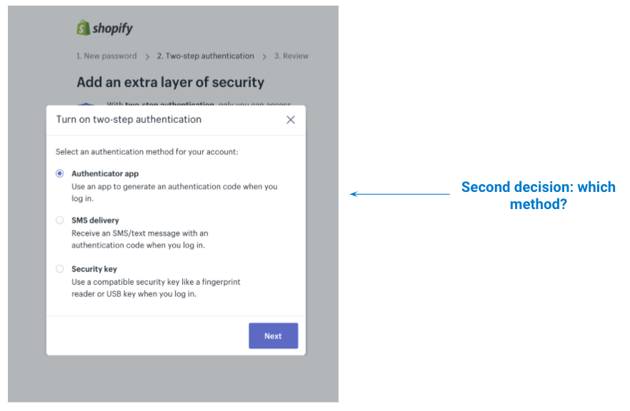
The first decision was whether you wanted two-step authentication at all. The second decision was which two-step method you wanted to use.
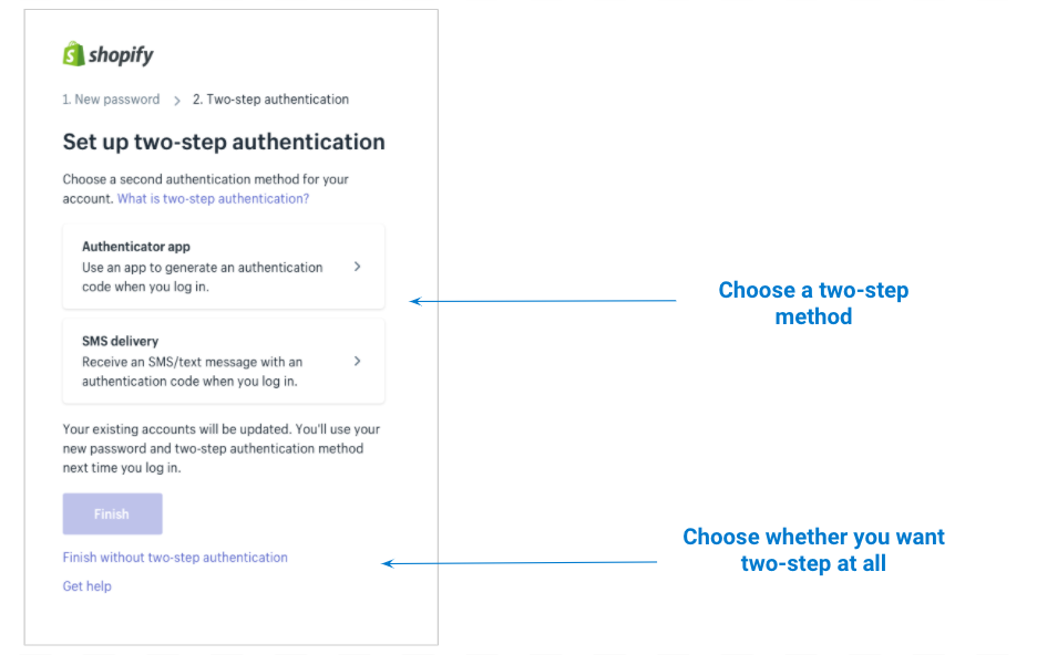
But in our current design, these decisions were in the wrong order!!! Choosing which two-step method you want is clearly a secondary decision, but in terms of visual weight and order on the page, it was coming first.
On top of that, these two decisions needed very different types of information. In order to decide if you wanted two-step authentication in the first place, the user needed to know:
- The benefits of two-step authentication
- How it works
- Is it right for my business?
In the current design, this decision was woefully under-supported. Most of the information needed to make this decision was buried in the help documentation instead of being emphasized up front.
A much better solution
Now that I understood what was wrong with the content hierarchy, I knew what I had to do to fix it. First we needed to re-arrange the page so that the decisions were in the right order. Then I needed to make sure that I was including the right information to support the first decision (whether to turn on two-step authentication or not).
Working with my designers, we reorganized the content on the page to better meet our users needs.
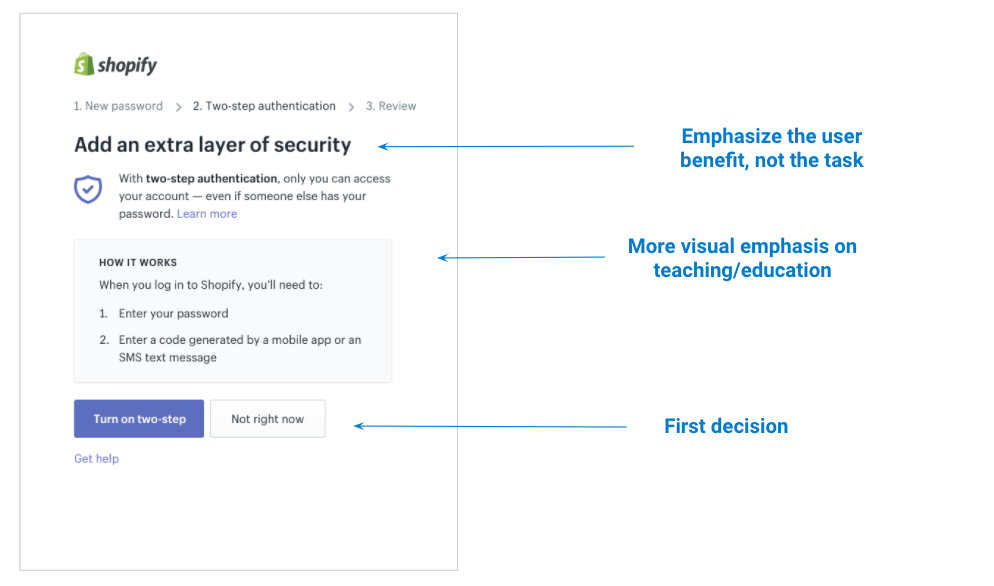
Then, if a user did decide to “Turn on two-step,” we revealed a modal that showed which authentication methods they can choose from. (We also added a third option — security keys!)
This new design did a much better job of showing users the right information at the right time to support better decision making.
The results
After we shipped this solution, 62 percent of users turned on two-step authentication when they previously hadn’t enabled it for their account. This was a strong signal that our solution was effective at encouraging users to add 2-step authentication to their account.
Post a comment